var('x y')
plot3d(
(3*x^2 + 2*y^2) / exp(x^2 + y^2), (x, -3, 3), (y, -3, 3),
color='lightgreen', opacity=0.8, aspect_ratio=[1, 1, 2]
)14 Surfaces and Functions of Two Variables
SageMath Spotlight
- 3D Surface Plots
plot3d(Section 2.4.1)
- Level Curves
contour_plot(Section 2.4.4)
Until now, we have primarily dealt with single-variable functions. For the remainder of the course, we will explore functions of two (or more!) variables (Stewart et al. 2020, 14.1, pp. 934). These functions take two numbers as inputs (often representing a coordinate in the \(xy\)-plane) and output a single number (often represented as a height, \(z\)); we think of \(x\) and \(y\) as independent variables and \(z\) as depending on both of them.
Formally, a function \(f\) of two variables is a rule that assigns a unique real number \(f(x, y)\) to each point \((x, y)\) in a set \(D \subset \mathbb{R}^2\) (called the domain).
14.1 Graphing \(z = f(x,y)\)
Much as we draw curves on a blackboard to represent functions \(f(x)\), we can represent the process of evaluating a function \(f(x,y)\) at every point in its domain by drawing a surface in 3D space. For a fun aside on an alternative visualization technique, one which we will not cover in this class but is much more general, check out this article on my website.
Our goal is to visualize the surfaces defined by \(z = f(x,y)\). While these plots still need to satisfy some old familiar rules, like the vertical line test, they can become difficult to understand very quickly! For more complicated functions, where manually tracing via planes (Section 13.3) is hard or impossible, we can ask SageMath to do the heavy lifting using the plot3d command. Consider the function:
Continuity is Not Guaranteed!
Just as in single-variable calculus, we have to be careful about our functions. A function of two variables can have sudden jumps, tears, asymptotes, or other discontinuities! In this course, we will focus primarily on continuous (and eventually differentiable) functions, but it is important to remember that surfaces can have these sorts of behavior. Notice the shearing in the plot below, where the function values abruptly drop from positive to negative along an axis:
14.2 The Graph as a Table
Another, decidedly more limited technique, is to restrict our attention to a discrete grid of inputs in our plotting domain, then represent values of \(f(x,y)\) as a table (Stewart et al. 2020, 14.1, pp. 936). By letting \(x\) and \(y\) vary—say, horizontally across columns and vertically across rows, respectively—the table acts as a low-resolution graph of our surface.
For example, if \(f(x,y) = x^2 - y^2\), a table on the domain \(-2 \le x \le 2\) and \(-2 \le y \le 2\) might look like this:
| \(x=-2\) | \(x=-1\) | \(x=0\) | \(x=1\) | \(x=2\) | |
|---|---|---|---|---|---|
| \(y=2\) | \(0\) | \(-3\) | \(-4\) | \(-3\) | \(0\) |
| \(y=1\) | \(3\) | \(0\) | \(-1\) | \(0\) | \(3\) |
| \(y=0\) | \(4\) | \(1\) | \(0\) | \(1\) | \(4\) |
| \(y=-1\) | \(3\) | \(0\) | \(-1\) | \(0\) | \(3\) |
| \(y=-2\) | \(0\) | \(-3\) | \(-4\) | \(-3\) | \(0\) |
These tables can be useful for reading off rates of changes as we progress towards computing derivatives, but are a bit hard on the imagination otherwise!
14.3 Level Curves
Those of us who have used topographic maps while on a hike have interacted with a much more sophisticated version of this concept! Indeed, topographic maps collapse 3D elevation data onto a flat 2D page by drawing curves of fixed height.
We can formalize the idea behind topographic maps using our knowledge of planes. In Section 13.3, we used horizontal planes (\(z = c\)) to study slices of quadric surfaces. If we apply this technique to a general function \(f(x,y)\), then draw the resulting level curves on a single plot, we obtain a contour plot (Stewart et al. 2020, 14.1, pp. 939). Where the curves are packed tightly together, the surface is steep; where they are spread far apart, the surface is relatively flat.
The level curves of a function \(f\) of two variables are the curves with equations \(f(x,y) = c\), where \(c\) is a constant in the range of \(f\).
We will explore three examples, visualizing both the 3D surface and two variations of the corresponding 2D contour map, via the plot3d (Section 2.4.1) and contour_plot (Section 2.4.4).
Example 14.1 (\(f(x,y) = \sin x + \cos y\)) This function creates a surface that looks something like an egg carton.
var('x,y')
f1(x,y) = sin(x) + cos(y)
surf1 = plot3d(
f1, (x, -6, 6), (y, -6, 6),
color='lightblue', opacity=0.7
)
show(surf1, aspect_ratio=[1,1,2])
cont1 = contour_plot(
f1, (x, -6, 6), (y, -6, 6),
contours=12, cmap='viridis'
)
cont1_labeled = contour_plot(
f1, (x, -6, 6), (y, -6, 6),
contours=8, linestyles='--', labels=True, fill=False
)
graphics_array([cont1_labeled, cont1]).show(axes=False, figsize=[8, 4])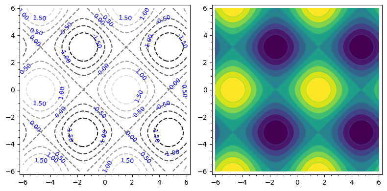
The cmap option is a new one: we can choose from a variety of options, such as 'cividis', 'plasma', 'magma', or even a custom gradient!
The leftmost contour plot uses labels to tell us the value corresponding to a given level curve. The rightmost plot, on the other hand, uses color: with this color scheme, darker colors are lower and brighter colors are higher!
Example 14.2 (\(f(x,y) = \frac{\sin x \sin y}{xy}\)) This function has its highest peak at the origin, and the ripples decay as we move further out.
var('x,y')
f2(x,y) = (sin(x)*sin(y)) / (x*y)
surf2 = plot3d(
f2, (x, -6, 6), (y, -6, 6),
color='lightcoral', plot_points=100, opacity=0.7
)
show(surf2, aspect_ratio=[1,1,5])
cont2 = contour_plot(
f2, (x, -6, 6), (y, -6, 6),
contours=12, cmap='magma'
)
cont2_labeled = contour_plot(
f2, (x, -6, 6), (y, -6, 6),
contours=8, linestyles='--', labels=True, fill=False
)
graphics_array([cont2_labeled, cont2]).show(axes=False, figsize=[8, 4])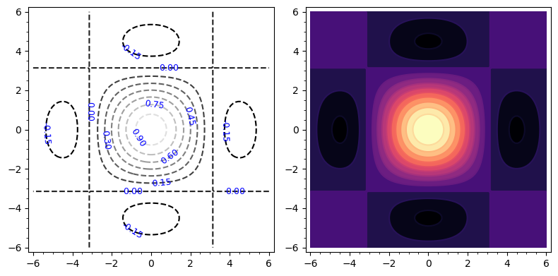
Example 14.3 (\(f(x,y) = x^4 + y^4 - 4xy\)) This function has two minima opposite a saddle-like shape at the origin. How can we tell from the different diagrams?
var('x y z')
f3(x,y) = x^4 + y^4 - 4*x*y
surf3 = implicit_plot3d(
z==f3, (x, -1.8, 1.8), (y, -1.8, 1.8), (z, -2, 1),
color='plum', plot_points=100, opacity=0.7
)
show(surf3)
cont3 = contour_plot(
f3, (x, -2, 2), (y, -2, 2),
contours=(-1.8, -1.2, -0.6, 0, 1, 2, 4, 8, 16), cmap='Spectral'
)
cont3_labeled = contour_plot(
f3, (x, -2, 2), (y,-2, 2),
contours=(-1.8, -1.2, -0.6, 0, 1, 2, 4, 8, 16), linestyles='--', labels=True, fill=False
)
graphics_array([cont3_labeled, cont3]).show(axes=False, figsize=[8, 4])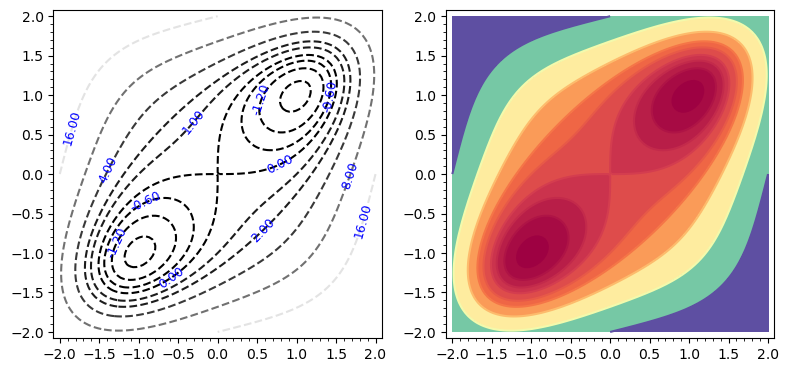
Notice how we have manually specified the \(c\) values for the contours here—what happens if we just set contours=12 or something similar?